What's the Difference Between Mobile and Desktop SEO?
Website Essentials
Welcome to Aaron Metosky Designs, your go-to destination for top-notch digital marketing services. In this article, we'll delve into the world of Search Engine Optimization (SEO) and explore the key differences between mobile and desktop SEO. As a leading player in the Business and Consumer Services industry, we understand the importance of optimizing your website for both mobile and desktop devices. So, let's dive right in and explore the intricate details of both mobile and desktop SEO!
The Significance of Mobile SEO
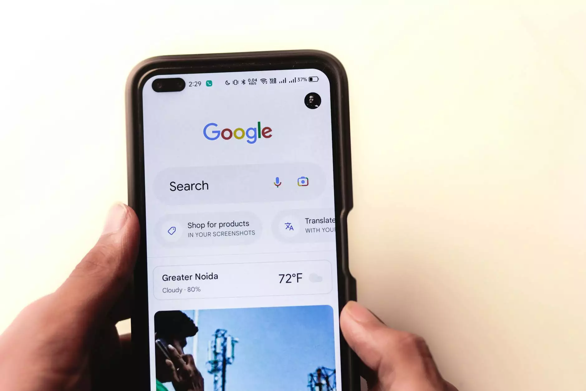
In today's tech-savvy world, where smartphones have become an integral part of our lives, optimizing your website for mobile devices is of utmost importance. With an increasing number of users relying on their mobile devices for internet browsing, your website must be mobile-friendly to capture this growing audience.
Mobile SEO focuses on specific strategies and techniques that enhance the visibility and performance of your website on mobile devices. Some key aspects of mobile optimization include responsive web design, page loading speed, mobile-friendly user interface, and the use of mobile-focused keywords. By implementing these practices, your website can provide a seamless browsing experience for mobile users.
Moreover, search engines like Google prioritize mobile-friendly websites in their search results, making it essential for businesses to optimize their web pages accordingly. By adapting to mobile SEO techniques, you can ensure that your website doesn't lose out on valuable traffic from mobile users.
The Foundations of Desktop SEO
While the mobile landscape continues to expand, desktop SEO remains a crucial aspect of your overall SEO strategy. Although the number of mobile users is increasing, many users still rely on desktop devices for their online activities.
Desktop SEO concentrates on optimizing your website for desktop users, focusing on factors like website navigation, user experience, and on-page content. It involves practices like keyword research, meta tags optimization, internal linking, and content optimization.
When users search for information on desktop devices, search engines display results based on various desktop SEO factors. By fine-tuning these aspects, you can ensure that your website ranks higher in search engine result pages (SERPs) and attracts desktop users effectively.
Understanding the Key Differences
While both mobile and desktop SEO share some similarities, there are significant differences that need to be considered. Let's explore these differences in detail:
1. User Behavior:
Mobile users often have different search behaviors compared to desktop users. Mobile searches tend to be more local and action-oriented, with users looking for quick answers and immediate solutions. On the other hand, desktop users may conduct more in-depth research and explore a wider range of topics. Understanding these differences in user behavior is crucial for tailoring your SEO strategy effectively.
2. Page Speed:
Page loading speed is a critical factor in mobile SEO. Mobile users expect fast-loading web pages, and search engines consider page speed as a ranking signal. On the other hand, while desktop users also appreciate faster page loading times, it may not be as crucial a ranking factor compared to mobile SEO. However, providing a smooth and fast user experience on both mobile and desktop devices is paramount for user satisfaction.
3. SERP Layout:
Search Engine Results Page (SERP) layouts differ on mobile and desktop devices. Mobile SERPs are designed to fit smaller screens, often displaying fewer organic results and more advertisements and featured snippets. Desktop SERPs, on the other hand, usually have a wider layout, allowing for more organic search results. Understanding these layout differences is essential to optimize your website's visibility and click-through rates on each platform.
Best Practices for Mobile and Desktop SEO
To achieve optimal rankings and visibility on both mobile and desktop devices, it's crucial to combine the best practices of mobile and desktop SEO. Here are some actionable tips:
1. Responsive Web Design:
Create a responsive website that adapts seamlessly to different screen sizes, ensuring a user-friendly experience across all devices. This eliminates the need for separate mobile and desktop websites, simplifies maintenance, and delivers consistent content to users.
2. Page Optimization:
Optimize your website's pages for mobile and desktop devices by prioritizing fast loading times, concise and engaging content, relevant keywords, and descriptive meta tags. Focus on delivering high-quality user experiences that align with the unique needs and behaviors of both mobile and desktop users.
3. Mobile-First Indexing:
With Google's mobile-first indexing, prioritize mobile optimization. Make sure your website is mobile-friendly and offers a seamless experience to mobile users. Ensure responsive design, fast-loading pages, and mobile-focused content to improve your chances of ranking higher in mobile search results.
4. Local SEO:
For businesses targeting local customers, incorporate local SEO strategies. Optimize your website for location-based keywords, create Google My Business listings, and engage in online directories and local citations. This will increase your visibility in local search results on both mobile and desktop devices.
5. Content Strategy:
Develop a comprehensive content strategy that caters to both mobile and desktop users. Ensure your content is engaging, informative, and accessible on all devices. Consider the differences in screen sizes and user behaviors to provide an optimal reading and browsing experience.
In Conclusion
In the ever-evolving digital landscape, understanding the difference between mobile and desktop SEO is vital for successful online presence. By implementing effective mobile and desktop optimization strategies, you can maximize your website's visibility, attract a larger audience, and stay ahead of the competition.
At Aaron Metosky Designs, we specialize in providing high-end digital marketing solutions for businesses in the Business and Consumer Services industry. Contact us today to leverage our expertise in mobile and desktop SEO, and let us help you achieve your online marketing goals.